`. So some html elements and classes might change acording to the module, options selected and viewport size

#### How to have the Logo on the same row as the Menu
In System > Template Styles > Cassiopeia > Advanced tab > Brand option, if set to Yes you can either
- select a Logo
- or type a Title (with or without a Tagline)
This works of course but given the Layout of Cassiopeia, this Logo or Title are on a separate row *before* the Header row typically containing the Menu.
OK, why not. There is probably a reason for that that I ignore but it is clearly not the practice on 99,9% of the websites.
So if you want your Logo on the same row as the Menu, you can simply proceed as follows
- Go to Content > Site Modules
- Click on New
- Select a module of type Custom (HTML)
- There insert simply your Logo (and if you wish add a hyperlink to the homepage, namely `"/"`)
- Select the Position `Menu`
- Assign the Module to All Pages (unless you have for example a different logo according to the Language)
- Save
#### Having a nice customized Footer
Create the appropriate new Module
- Go to Content > Site Modules *or* go to System > Manage > Site Modules (yes, 2 ways to get there 🙂)
- Click on the New Button
- Select the Module of Type Footer ("This module shows the Joomla! copyright information.")
- Give a Title
- Select Position `Footer`
- If necessary go to the Menu Assignment tab and customize
- Save
See the result on the front-end
- two lines of text appear in the footer of the site. The nice thing is that the Year and the Site Name are created dynamically
- the displayed text is determined by the native Language Strings of Joomla, namely
- MOD_FOOTER_LINE1
`Copyright © %date% %sitename%. All Rights Reserved.`
- MOD_FOOTER_LINE2
`
Joomla! is Free Software released under the
GNU General Public License.`
Customize those two Language Strings
- Go to System > Manage > Language Override
- Select the front-end language of your choice
- Click on New
- Search for the following Constant: `MOD_FOOTER_LINE1`
- Click on the corresponding Result
- Change the Text by what you want, for example: `© %date% %sitename% |
Privacy`
- Do the equivalent for `MOD_FOOTER_LINE1`
- If you have a multilingual website, repeat this for each Language
If you want to have both Texts on the same Row on large screens (which is nicer I think) simply add the following CSS to `/media/templates/site/cassiopeia/css/user.css` in J4.1+ (was `/templates/cassiopeia/css/user.css` in J4.0)
```css
footer div.mod-footer {
display: flex;
flex: 1 1 0%;
flex-direction: column;
justify-content: space-between;
align-items: center;
}
@media (min-width: 768px) {
footer div.mod-footer {
flex-direction: row;
}
}
```
This is not specific to Cassiopeia: that Footer was already there since the Mambo days I hear. But since Cassiopeia does not have tens/hundreds of Options, this is a very elegant way to get a nice customized footer.
#### Customizing the Blog View layout
Beyond the classical Options available in Joomla for the Blog View, Cassiopeia has some handy Classes that can be set in the Menu Item (of type Blog View) > Blog Layout tab > Article Class option:
- boxed
- image-right
- image-left
- image-alternate (in combination with image-right or image-left)
- image-bottom
For more information, see
Other Classes are also available in Cassiopeia which allow for example to have a "Masonry" Layout:
- columns-2
- columns-3
- columns-4
- masonry-2
- masonry-3
- masonry-4
See an example of `masonry-3` on
I am not too sure about the use of `columns-X` because there is now an Option #Columns (which was not there initially in the first drafts of J4)
#### Articles Images - Left, Center or Right
Joomla 4 has changed the float options for images: there is no select box with "right", "left" or "none" anymore, but a field to insert a css class. Cassiopeia offer the classes "float-start" for positioning the full image on the left (on the right for rtl languages), "float-end" for positioning the full image on the right (on the left for rtl languages) and "float-none" for no floating.
Of course it is also possible to modify the position of the image using own css classes. Examples:
- `float-start`
- `float-end`
- `float-center` which would then be your own css definition in the `/media/templates/site/cassiopeia/css/user.css` in J4.1+ (was `/templates/cassiopeia/css/user.css` in J4.0) file:
```CSS
.float-center.item-image {
text-align: center;
}
```
You can use the classes globally for all articles, go to Content -> Options -> Editing Layout and enter the class you want in the field "Full Text Image Class".
Or you can use the classes on each individual article:
Source : Viviana on
#### Module Styles - card or noCard
- Go to Module > [ your module ] > Advanced tab > Module Style option
- There you see that Cassiopeia ships with two own Styles
- card
- noCard
Of course, you still have the standard Joomla Module Styles, namely
- html5
- none
- outline
- table
#### Changing the Layout ie moving Positions around
If you inspect a website using Cassiopeia you will see the following CSS:
```css
@supports (display: grid) {
.site-grid {
grid-template-areas:
". banner banner banner banner ."
". top-a top-a top-a top-a ."
". top-b top-b top-b top-b ."
". comp comp comp comp ."
". side-r side-r side-r side-r ."
". side-l side-l side-l side-l ."
". bot-a bot-a bot-a bot-a ."
". bot-b bot-b bot-b bot-b .";
}
@media (min-width: 992px) {
.site-grid {
grid-template-areas:
". banner banner banner banner ."
". top-a top-a top-a top-a ."
". top-b top-b top-b top-b ."
". side-l comp comp side-r ."
". bot-a bot-a bot-a bot-a ."
". bot-b bot-b bot-b bot-b ."
}
}
}
```
This is CSS Grid. It is very easy and very visual as you can see.
If you know little or nothing about CSS Grid, it is definitely worth learning the basic for example on
So if you would like to adapt the Layout and have for instance on desktop view
- the Position `banner` right after the component area
- and the bottom Positions `bot-a` and `bot-b` on the same row fifty-fifty
all it takes is to add the following CSS to `/media/templates/site/cassiopeia/css/user.css` in J4.1+ (was `/templates/cassiopeia/css/user.css` in J4.0)
```css
@supports (display: grid) {
@media (min-width: 992px) {
.site-grid {
grid-template-areas:
". top-a top-a top-a top-a ."
". top-b top-b top-b top-b ."
". side-l comp comp side-r ."
". bot-a bot-a bot-b bot-b ."
". banner banner banner banner ."
}
}
}
```
With other words, the nice thing about having a template based on CSS Grid is that you can change the Layout just with a few lnes of CSS, without having to edit/override/fork any PHP file.
#### Changing the width of Left / Component / Right areas
##### Case 1 - when Cassiopeia's Layout is set on Fluid
What determines the width of the columns in this case is the following CSS line (being CSS Grid):
```CSS
body.wrapper-fluid .site-grid {
grid-template-columns: [full-start] minmax(0,1fr) [main-start] repeat(4,minmax(0,25%)) [main-end] 100px [full-end]
}
```
Note the part in the middle, namely `repeat(4,minmax(0,25%))`
This is equivalent to `minmax(0,25%) minmax(0,25%) minmax(0,25%) minmax(0,25%)` :
- The first `minmax(0,25%)` determines the width of the Left position
- The last `minmax(0,25%)` determines the width of the Right position
- And the two `minmax(0,25%)` in the middle make the 50% devoted to the Component area (being for example the selected Article)
So for example if I want to reduce Left and Right from 25% width to 20%, I would simply add the following CSS to `/media/templates/site/cassiopeia/css/user.css` in J4.1+ (was `/templates/cassiopeia/css/user.css` in J4.0)
```CSS
body.wrapper-fluid .site-grid {
grid-template-columns: [full-start] minmax(0,1fr) [main-start] minmax(0,20%) minmax(0,30%) minmax(0,30%) minmax(0,20%) [main-end] 100px [full-end]
}
```
##### Case 2 - when Cassiopeia's Layout is set on Static
In this case, for a large screen (remember: Cassiopeia is Mobile First) what determines the width of the columns is the following CSS line (still CSS Grid):
```CSS
@supports (display: grid) {
@media (min-width: 992px) {
.site-grid {
grid-template-columns: [full-start] minmax(0,1fr) [main-start] repeat(4,minmax(0,19.875rem)) [main-end] minmax(0,1fr) [full-end]
}
}
}
```
Note the part in the middle, namely `repeat(4,minmax(0,19.875rem))` (rem being a Relative Unit)
This is equivalent to `minmax(0,19.875rem) minmax(0,19.875rem) minmax(0,19.875rem) minmax(0,19.875rem)` :
- The first `minmax(0,19.875rem)` determines the width of the Left position
- The last `minmax(0,19.875rem)` determines the width of the Right position
- And the two `minmax(0,19.875rem)` in the middle make the 50% devoted to the Component area (being for example the selected Article)
So for example if I want to reduce Left and Right from 19.875rem to 9.875rem (but still keep the same total width), I would simply add the following CSS to `/media/templates/site/cassiopeia/css/user.css` in J4.1+ (was `/templates/cassiopeia/css/user.css` in J4.0)
```CSS
@supports (display: grid) {
@media (min-width: 992px) {
.site-grid {
grid-template-columns: [full-start] minmax(0,1fr) [main-start] minmax(0,9.875rem) minmax(0,29.875rem) minmax(0,29.875rem) minmax(0,9.875rem) [main-end] minmax(0,1fr) [full-end]
}
}
}
```
Of course I could also very easily change the total width by playing with the sum of 4*19.875rem
### Banner
#### Adding a Banner in Cassiopeia
See "Adding a Site header" on
#### Making the Banner in Cassiopeia compatible with Responsive Image plugin of Dimitris
[ edit : added on 2022 03 30 ]
If you care about performance (and serving the images in the right size and format for each visitor according to their browser and viewport), you should definitely install this little free plugin made by Dimitris Grammatikogiannis :
See the description on for more information
The "responsive images" plugin made by Dimitris triggers automatically for images which are part of the content.
In Cassiopeia the background image for the Banner Module is technically served... as a *background-image* in CSS.
So obviously the "responsive images" plugin cannot play its role because its needs the image to be in the HTML.
With the following Alternate Layout, the "background image" is actually a real HTML element (looking like a background image thanks to CSS Grid) so that the plugin will trigger on it:
#### How to Customize the height of the Banner Module
Simply adapt the following CSS to your needs and add it to `/media/templates/site/cassiopeia/css/user.css` in J4.1+ (was `/templates/cassiopeia/css/user.css` in J4.0)
```CSS
/* CLASSIC BANNER */
.container-banner .banner-overlay {
height: max(300px, 50vh); /* by default is 50vh in Cassiopeia */
}
@media (min-width: 768px) {
.container-banner .banner-overlay {
height: max(300px, 45vh);
}
}
@media (min-width: 992px) {
.container-banner .banner-overlay {
height: max(300px, 40vh);
}
}
@media (min-width: 1200px) {
.container-banner .banner-overlay {
height: max(300px, 35vh);
}
}
```
#### How to add an overlay to the Banner Module
Simply adapt the following CSS to your needs and add it to `/media/templates/site/cassiopeia/css/user.css` in J4.1+ (was `/templates/cassiopeia/css/user.css` in J4.0)
```CSS
/* CLASSIC BANNER */
.container-banner .banner-overlay .overlay {
background-image: linear-gradient(120deg, rgba(231, 48, 42, 0.7), rgba(234, 174, 2, 0.7));
}
```
#### How to add a Video Banner Module
Cassiopeia foresees a Banner Module having a background image, which takes about 50% of the viewport height.
For a website I wanted
- to have a Video in the background instead of a picture
- the video to take exactly the whole height of the browser
To do this
- create a basic Custom HTML Module without changing any of the Options
- paste the following HTML (adapt of course with your own video & image)
- paste the following CSS in `/media/templates/site/cassiopeia/css/user.css` in J4.1+ (was `/templates/cassiopeia/css/user.css` in J4.0)
HTML:
```HTML
```
CSS:
```CSS
/* VIDEO BANNER - see https://codepen.io/woluweb/pen/rNGROZj */
div.video-banner {
display: grid;
grid-template-areas: "hero";
place-items: center;
height: max(300px, calc(100vh - 152px)); /* viewport height minus the fixed height of menu header on current website, with a minimum of X pixels */
box-shadow: 0 0.125rem 0.25rem rgba(0, 0, 0, 0.5);
}
div.video-banner > * {
grid-area: hero; /* stacking all the child elements of the grid - could simply have set 1 / 1 / 2 / 2 instead of naming the area hero */
}
div.video-banner div.text {
z-index: 1; /* to be sure that this is on top of the video */
text-align: center;
color: white;
text-shadow: 2px 2px 5px black;
}
div.video-banner div.overlay {
width: 100%;
height: 100%;
background-image: linear-gradient(120deg, var(--cassiopeia-color-link), var(--cassiopeia-color-hover));
opacity: 0.7;
}
div.video-banner video {
width: 100%;
height: 100%;
object-fit: cover;
overflow: hidden;
}
```
### Adding a custom Javascript
#### Option 1 - directly in user.js
- Just like you can create a custom CSS file in `/media/templates/site/cassiopeia/css/user.css` in J4.1+ (was `/templates/cassiopeia/css/user.css` in J4.0)
- You can create a custom JS file in `/media/templates/site/cassiopeia/js/user.js` in J4.1+ (was `/templates/cassiopeia/js/user.js` in J4.0)
Type for example the following code in `user.js` and you will have a popup appearing in the front-end:
```JS
alert( 'Hello, world!' );
```
#### Option 2 - using a Child Template
This requires J4.1 (release date : 15 February 2022)
See in the Resources the presentations made by Dimitris.
- Go to System > Site Templates > Cassiopeia Details and Files
- Click on the Create Child Template button
- Close
- The Child Template is ready
- It can be seen next to the Parent Template in System > Site Templates
- You can customize it (create for example a file index.php at the root based on the original one but where you tweak/add something)
- Go to System > Site Templates Styles
- Make the Child Template default (or open it if you wish to customize the Options and/or Menu Assignemnts)
#### Option 3 - adding Options to Cassiopeia with a Child Template
By editing the Child Template XML file, you can easily add new Options to the Template (textarea, radio, ...).
So then you can customize index.php, get this parameter and make something of it (like adding a Script in the Head)
`params->get('myJS'); ?>`
#### Option 4 - using an Module Alternate Layout
Actually with any Template and with any Joomla version, you can also very easily add any CSS or (inline or external) JS.
The idea is to create a Module which will inject all the CSS & JS thanks to an Alternate Layout (Override).
The advantage of this technique: you can
- use all the possible Assignments available in Modules so that the code is not loaded on all pages but only on the pages where it is necessary
- filter on language
- have a start/end date for publishing
- ...
Here is the procedure
- Create an Override for the Module `Custom HTML` (note that you could actually use basically any other Module type)
- Go to System > Site Templates > [ your template ] Details and Files
- Select the Create Overrides tab
- Click on mod_custom
- You get the confirmation message `Override created in /templates/cassiopeia/html/mod_custom`
- Transform the Override into an Alternate Layout
- Select the Editor tab
- Click on /templates/cassiopeia > html > mod_custom > default.php
- Click on the Rename File button
- Give a name of your choice, for example `add-to-head`.php
- Edit the Alternate Layout
- Now instead of showing the "Content" of the Custom HTML Module we wil simply add some code which can add CSS and JS (inline of local/external files) to the Head of the page
- See for example the PHP hereafter (which you will want to adapt of course)
- See those interesting resources about Adding JavaScript and CSS in Joomla
(addStyleSheet, addStyleDeclaration, addScript, addScriptDeclaration)
- But there are even probably even better ways to do it "the Joomla4 way" (**please get back to me if you can help improve this example**)
- Create a Custom HTML Module
- Go to Content > Site Modules
- Click on New
- Select Custom
- Select the Advanced tab
- In the Layout option, select the Alternate Layout you have created (in this case `add-to-head`)
Arbitrary example of code for our Alternate Layout (adding an animation for .images, h2 and h3):
```PHP
addStyleSheet("/templates/cassiopeia/css/animate.css", array('version'=>'auto'));
// either via a distant file - see https://cdnjs.com/libraries/animate.css
$doc->addStyleSheet("https://cdnjs.cloudflare.com/ajax/libs/animate.css/4.1.1/animate.min.css", [], ["integrity" => "sha512-c42qTSw/wPZ3/5LBzD+Bw5f7bSF2oxou6wEb+I/lqeaKV5FDIfMvvRp772y4jcJLKuGUOpbJMdg/BTl50fJYAw==", "crossorigin" => "anonymous" , "referrerpolicy" => "no-referrer" ]);
// adding some script for animation using intersection-observer
// either via a local file (to be added manually)
// $doc->addScript('/templates/cassiopeia/js/animate.js', array('version'=>'auto'));
// either via an inline script
$myAnimation = << 0.5) {
observable.target.classList.add('mytest')
// observable.target.classList.remove('not-visible')
observer.unobserve(observable.target)
}
})
}, {
threshold: [0.5]
});
// we observe the elements
let items = document.querySelectorAll('.image, h2, h3')
items.forEach(function (item) {
observer.observe(item)
})
});
MYJS;
// add the script
$doc->addScriptDeclaration($myAnimation);
```
with the corresponding addition to `/media/templates/site/cassiopeia/css/user.css` in J4.1+ (was `/templates/cassiopeia/css/user.css` in J4.0) where all the animations would be defined:
```CSS
h2.mytest, h3.mytest, p.mytest {
animation: fadeIn; /* referring directly to the animation's @keyframe declaration */
animation-duration: 2s; /* don't forget to set a duration! */
}
```
#### Option 5 - for Bootstrap 5
Context:
- Joomla 4 ships with Bootstrap 5
- But to make your websites a.o. more performant, BS5 Javascript is not loaded by default
- Instead you can decide yourself in your child templates / overrides / alternate layouts to enable only what you need & where you need it
Suppose you need to use Tabs in a given Article. There copy-paste the following HTML (taken from the examples on ):
```HTML
```
See the result in the front-end: the Tabs do appar, but clicking on the 2nd or 3rd Tab does not "do" anything.
This is because we still need to tell Joomla to load the Javascript for Tabs, namely via
```PHP
\Joomla\CMS\HTML\HTMLHelper::_('bootstrap.tab', '.selector', []);
```
You can easily add any Bootstrap Javascript to Cassiopeia by following the Official Documentation:
If you follow "Approach 3: Using a Template Override" don't forget to add the Module Class `bs-tab` to the Module you create and then the Tabs will be working.
### Menu
#### How to Use the Menu with Cassiopeia in Joomla 4
- Vertical Menu in the Right Sidebar
- Horizontal Menu
- Moving the Menu to the Footer
See
#### Adding an icon to a Menu Item - requires J4.1
- Search for an icon on . For example `fas fa-envelope` and `far fa-envelope` (note: fa**s** stands for Solid and fa**r** stands for Regular)
- Go to Menu > [ your menu ]
- Click on the chosen Menu Item
- Open the Link Type tab
- Fill in the Link Icon Class option with the desired value, for example `fas fa-envelope`
- See the result in the front-end
Txs to Christiane Maier-Stadtherr for this new feature added in J4.1
Note: this does not impose Font Awesome: it will work with any icon font the template wants to use (obviously the template would have to support an icon font for it to work)
More information on
#### Adding an icon to a Menu Item - before J4.1
In Joomla 4.0 you could reach a similar result in a manual way
- Add to the Menu Item a Link Class `my-icon-home` for example
- Then add the following CSS to `/media/templates/site/cassiopeia/css/user.css` in J4.1+ (was `/templates/cassiopeia/css/user.css` in J4.0)
```css
ul.mod-menu a.my-icon-home::before {
font-family: "Font Awesome 5 Free";
font-weight: 900;
content: "";
margin-right: 4px;
display: inline-block;
width: 1.25em !important;
}
```
Besides this, you could also use only the icons mapped here as Font Awesome classes without further ado:
#### How to have a Hamburger Menu in Cassiopeia
See "Change the Menu Layout" on
#### Having Hamburger Menu before Logo on small screens even if it is after on big screens
Typically on a website you would have in the Menu Position the following modules in this order
1. Logo (Custom HTML Module)
2. Menu
3. Language Switcher Module and/or Search Module
But on mobile view this is annoying because our Hamburger Menu (assuming we are using the Collapsible Dropdown Style for the Menu Module) stays "in the middle".
If you want to change the order and have that Hamburger Menu first, simply add the following to `/media/templates/site/cassiopeia/css/user.css` in J4.1+ (was `/templates/cassiopeia/css/user.css` in J4.0)
```CSS
@media (max-width: 992px) {
nav.navbar {order: -1;}
}
```
### Accessibility
This is a J4 feature, not a Cassiopeia feature as such. But since Cassiopeia is conceived from scratch to be Accessible it is worth reminding those two features:
- enabling/configuring the Accessibility plugin (this adds the wheelchair icon at the bottom-left)
- Go to System > Manage > Plugins
- Search for `accessibility`
- Edit the `System - Additional Accessibility Features` plugin
- Select whether you want front-end and/or backend
- Set Status to Enabled
- Save
- enabling/configuring the SkipTo plugin (press Tab when opening a page or press Alt+9 any time in order to have dynamically generated links to all Menu Items but also all Titles and Modules)
- Go to System > Manage > Plugins
- Search for `skip`
- Edit the `System - Skip-To Navigation` plugin
- Select whether you want front-end and/or backend
- Set Status to Enabled
- Save
### Variables with !default value in scss
[ added on 2022.04.24 ]
See
In this PR Rick Spaan added the "!default" setting to all the Cassiopeia variables. There where some variables who had already this setting in place, but now all variables are set as default. Setting the"!default" makes is easier for developers to create custom styling based on the Cassiopeia template for child themes for instance.
### An example of Installable Child Template
[ added on 2022.04.26 ]
Frantisek from the Czech Joomla Community sent me this interesting link
The Child Template can be downloaded at the bottom of the page (section "Přílohy", namely *attachments*).
It is new (installable !) Cassiopeia Child-template:
- We added some great features as well. You might be interested in the new Child-template features.
- You can set custom colors and background images for all sections of the template.
- You can set font weight and various new fonts for the headings and default font of the Cassiopeia template.
- You can set different menu types and more. The template also supports Swiper Touch Slider. All files are free to download.
- We are also fixing some bugs in the default template
Note:
-
-
-
### Customizing error.php, index.php etc
[ added on 2022.09.07 ]
Today someone asked me whether it was possible to override `error.php` without editing the original Cassiopeia file (because then you would loose your customizations potentially at every update).
So I checked: this works fine with Child Templates. Actually it is the idea behind Child Template: you can override the "root" files like
- `index.php`
- `error.php`
- `component.php`
- `offline.php`
The only thing is that you need to copy-paste the files *manually*.
Apparently the interface does not allow (yet) to do it.
### Card Layouts
[ added on 2022.10.04 ]
Do you need a Card Layout?
See by Brian Teeman.
Description: "Installable com_content/category overrides with configuration settings to create card layouts. Uses default bootstrap css only."
## Some issues aka coming improvements
I spotted a few issues with Cassiopeia.
### Issue 1 - the Hamburger Menu on small screens
On a website, you would typically have in the header
1. the Logo
2. the Menu Items
3. the Language switcher and/or the Search
But on smartphone (more generally on small screens) even when using the Cassiopeia Collapsible Dropdown Menu, clicking on the Hamburger Menu gives something ugly:
- it pushes the rest of the header elements. In my example on this screenshot
- the logo is pushed to the right, according to the length of the longest Menu Item
- there is no room left for the Language Switcher so it comes on a new row
- and of course the content of the whole site is pushed downwards
- instead of having for instance a nice offcanvas

It seems that the "default" behaviour of Boostrap 5 is indeed to push the content down:
But there is also an offcanvas solution:
Can someone please help adding an Alternate Layout for the Menu Module in order to implement this offcanvas solution (which could then be a new Cassiopeia Alternate Layout of the Menu Module)? Txs!
**Breaking news**: Viviana Menzel is currently working on this. Give it a try!
See
There are two Alternate Layouts: one for "default" menu and one for "metismenu":
- The files should be copied into `/templates/cassiopeia/html/mod_menu` or in `/templates/cassiopeia_CHILD/html/mod_menu` if you want to make this override available only for you Child Template
- There are a few lines of css to be added to `/media/templates/site/cassiopeia/css/user.css` in J4.1+ (was `/templates/cassiopeia/css/user.css` in J4.0)
Note: if create your override in a Child Template (ie `/templates/cassiopeia_CHILD/html/mod_menu`) then don't forget to also copy all the `dropdown-metismenu.php` PHP files of `/templates/cassiopeia/html/mod_menu` because they are required.
If you want to change the current breakpoint (between offcanvas and full regular menu), simply change the following class `navbar-expand-lg` into `navbar-expand-xl` (offcanvas will prevail longer) or `navbar-expand-md` (offcanvas will prevail less longer) for example.
Please test and give your feedback!
### Issue 2 - the Read More button partially hidden
[ edit 2022.02.10 - Viviana Menzel proposed a **fix** for this issue on ]
On a Blog View, according to the lenght of the text and the viewport (mobile view), the Read More button is often partially or even totally hidden:
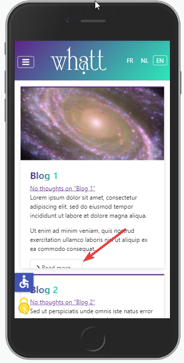
Viviana Menzel helped me with the issue, noticing that disabling the following CSS line fixes the issue on mobile view:
```CSS
.image-left .blog-item .item-image, .image-right .blog-item .item-image {
flex: 1 0 40%;
}
```
Since this line is useful on a wide screen and apparently has a side-effect only on mobile view we should probably simply add a media query to disable it or adapt it.
For example add the following to `/media/templates/site/cassiopeia/css/user.css` in J4.1+ (was `/templates/cassiopeia/css/user.css` in J4.0)
```CSS
@media (max-width: 992px) {
.image-left .blog-item .item-image, .image-right .blog-item .item-image {
flex: 1 1 40%;
}
}
```
### Issue 3 - Layout in Blog View
[ edit 2022.02.10 - Viviana Menzel proposed a **fix** for this issue on https://issues.joomla.org/tracker/joomla-cms/36998 ]
When using Article Class `image-right` for a Blog View (1 column for instance), I noticed that the Images and Introtext would not display evenly: when the Introtext is too short for example when the Image on the Right comes next to the Text on the Left (instead of having a 50%-50% Layout).
Illustration with `image-right image-alternate boxed` (but I double-checked: `image-right` is enough to create the issue)

I did not have much time to investigate this but as a quick workaround I added the following to `/media/templates/site/cassiopeia/css/user.css` in J4.1+ (was `/templates/cassiopeia/css/user.css` in J4.0)
```CSS
.image-left .blog-item .item-content, .image-right .blog-item .item-content {
flex: 1 0 40%;
}
```
If you can investigate further and fix Cassiopeia for this it would be highly appreciated.
## Thank you
**Joomla User Group New Jersey** for having me today
**So many members of the Joomla Community** for being #jPositive
😉
## Get in touch
Any suggestion about this presentation?
Please feel free to contact me. I'll be happy to keep improving it 🙂
[Marc Dechèvre](https://www.facebook.com/marc.dechevre) | [woluweb](https://twitter.com/woluweb)
+32 474 37 13 12 | +32 2 772 58 69

 This presentation was done several times at different events and in different languages